11 February 2014
Tutorial: Methods for positioning text
At the basic level, creating and positioning text in Corona SDK is simple: just create the object at the desired position in the specified font size and you’re done. For example:
|
1 |
local myText = display.newText( "Hello World", 200, 200, native.systemFont, 16 ) |
However, when you need to position/align text in creative ways, things get a bit more complicated. In this tutorial, we’ll inspect the actual display object that Corona generates via display.newText() so that you can understand and achieve advanced positioning and alignment.
The basics
Under the hood, Corona takes the information that you pass to the display.newText() API and it generates an image, rendered to texture memory like any other display object. Because Corona SDK uses the operating system’s font rendering, fonts may render differently between devices and the Corona Simulator, in particular between Windows and OS X.
Single-line method
The most basic usage of display.newText() is the single-line method. Using this method, you simply output a string of text to the screen. Once it’s rendered by Corona, the theoretical “bounding box” (indicated by the green line) will fit precisely around the text display object:

In regards to screen position, the x and y of this “box” is based upon its center point. You can, of course, position any text object via this center point, but if you’re building a series of text objects such as labels on a statistics screen, you’ll probably want to left-align all of them to a vertical “guide line.” This can be accomplished using anchor points, where — in regards to the x position — an anchor point of 0 indicates the left-most point of the object, 0.5 indicates the center x point, and 1 indicates the right-most point. A similar concept applies to the y anchor point, where a y anchor of 0 represents the object’s top, 0.5 the vertical middle, and 1 the object’s bottom.
Let’s inspect a basic example:
|
1 2 3 4 5 6 |
local myText = display.newText( "Hello World", 0, 0, native.systemFont, 16 ) myText:setFillColor( 0, 0, 0 ) myText.anchorX = 0 myText.x = 10 myText.y = 100 |
Because the anchorX value is set to 0 (the left edge), and the x value is set to 10, this code block positions the text with its left edge 10 points to the right of the content area’s vertical 0 point. Remember, however, that you’re not “aligning the text,” but rather positioning its bounding box (this point will become more important further on).
Multi-line method
For more advanced alignment, you may utilize the multi-line method. In this case, you pass a table of options to the display.newText() call. Most of these options mimic those from the “shorthand” single-line declaration outlined above, but there are three additional properties which extend the alignment possibilities: width, height, and align.
width
This property specifies the width of the multi-line “bounding box” in pixels. This is similar to drawing a flexible text box in a graphics application like Photoshop or Illustrator, where the text — no matter how much you enter within the box — will wrap within the confines of its boundaries. As expected, if a word is too long to fit within the remaining width available on that line, it will wrap to the next line.
height
If specified, the text will be cropped at this value, in pixels. If you want an “unlimited” height for the text box, set this value to 0 and the box height will adjust depending on the amount of text within it. However, it will never exceed the maximum texture size limit for the device.
align
This specifies the alignment of the text when the width parameter is supplied. Default value is "left". Valid values are "left", "center", or "right". We’ll discuss this in more detail shortly.
Principles of alignment
Although it may seem non-intuitive to create a single line of text using the multi-line method, let’s explore the advantages from Corona’s standpoint:
|
1 2 3 4 5 6 7 8 9 10 11 12 |
local options = { text = "Hello World", x = display.contentCenterX, y = display.contentCenterY, fontSize = 24, width = 200, height = 0, align = "left" } local textBox = display.newText( options ) textBox:setFillColor( 0, 0, 0 ) |
Because the string Hello World, in the default system font at size 24, fits within the width of 200 pixels, it won’t wrap to a second line. Thus, this code visually produces a single line of text. However, while it may appear the same as the first example, it’s important to understand that the “bounding box” is now 200 pixels wide, not the pixel width of the actual text that you see on the screen:
In this manner, you can build a series of fixed-width text boxes and position them in a more unified manner rather than dealing with various text object sizes produced via the single-line method.
Want to right-align the text? Simply change the align parameter to "right"…
Or you may change it to "center"…
In addition to these flexible alignment options, another advantage to multi-line method is that it lets you change the value of the .text property and, if the new string is longer or shorter, the box remains at the fixed width and the text won’t shift unexpectedly. In single-line mode, by comparison, if you position a text object by its center point and change the text string, the object may not align as you intended.
Multiple lines
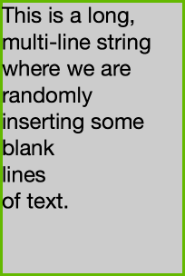
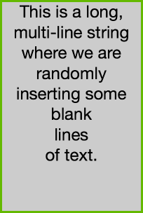
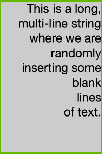
Of course, multi-line mode supports multiple lines as well! Let’s see how it looks in the three different alignment options:

“left”
|
1 2 3 4 5 6 7 8 9 10 11 12 13 14 15 16 17 |
local myText = [[This is a long, multi-line string where we are randomly inserting some blank lines of text.]] local options = { text = myText, x = display.contentCenterX, y = display.contentCenterY, width = 200, height = 300, fontSize = 24, align = "left" } local textField = display.newText( options ) textField:setFillColor( 0, 0, 0 ) |

“center”
|
1 2 3 4 5 6 7 8 9 10 11 12 13 14 15 16 17 18 19 20 |
local myText = [[This is a long, multi-line string where we are randomly inserting some blank lines of text.]] local options = { text = myText, x = display.contentCenterX, y = display.contentCenterY, width = 200, height = 300, fontSize = 24, align = "center" } --Output the text box with the specified options local textField = display.newText( options ) textField:setFillColor( 0, 0, 0 ) |

“right”
|
1 2 3 4 5 6 7 8 9 10 11 12 13 14 15 16 17 18 |
local myText = [[This is a long, multi-line string where we are randomly inserting some blank lines of text.]] local options = { text = myText, x = display.contentCenterX, y = display.contentCenterY, width = 200, height = 300, fontSize = 24, align = "right" } --Output the text box with the specified options local textField = display.newText( options ) textField:setFillColor( 0, 0, 0 ) |
As you can see, the align option affects the positioning of the text within the box. In all of these examples, the height of the box is defined at 300. If you set the height to 0, the bounding box will match the actual height of the text. However, this may affect vertical alignment depending on the box’s y anchor setting. Also, while a height setting of 0 creates a text box of “unlimited” height, the text that is created will never exceed the device’s texture size limit. This is an important restriction to be aware of if you place a significant amount of text into a single text box.
On the topic of multiple lines…
In Lua, there is some confusion around how to put line breaks into strings. While Lua supports the traditional double quotes ("...") or single quotes ('...'), it also supports multiple lines via the [[...]] declaration. As such, you may use this method or the Unix “Newline” character (\n) within quotes:
|
1 2 3 4 5 6 7 |
longString = [[This is a really long string with multiple line breaks.]] --OR... longString = "This is a really\nlong string\nwith multiple\nline breaks." |
Note that if you attempt to input multiple lines using Corona’s single-line method, the line breaks will be ignored.
In summary
Hopefully this tutorial has shown you some useful techniques for aligning text in Corona SDK. With the single-line method and the more powerful multi-line method, almost any alignment scenario should be possible with just a few lines of code.


JCH
Posted at 23:58h, 11 FebruaryUnfortunately it’s not very easy to change color inside a text (for instance to highlight a search result).
What about a “htmlText” option that would allow “simple” changes like color or attributes (bold, italic)
Rob Miracle
Posted at 15:20h, 12 FebruaryCorona SDK display.newText() isn’t designed for doing rich text. We recommend that you write a small HTML/CSS file out to your temporary directory and show it with a native.newWebview if you need more stylized text. There have been a couple of community projects to support more rich text as display objects. You would have to search the forums for it.
JCH_APPLE
Posted at 22:21h, 12 FebruaryThank you. Hope it will be included one of these days, it will help a lot.
David Gross
Posted at 00:28h, 02 FebruaryI have created a sophisticated text rendering module that allows many HTML formats, e.g. bold, italic, even styles of a sort. I use it for books. Very fast. Ask me about it if you wish.
Andrea
Posted at 09:20h, 15 JanuaryI’m very newbie in corona,
i’m trying to create a view in composer with
a scrollview with dinamic text from local db
TITLE(short no wrap)
text(short no wrap)
text(short no wrap)
longtext(long wrap)
i try webview, it’s easy to crate webpage dynamically and display it on a wiev, but unfortunatelly webview not support transitions when i change a view, so i’m puzzled… is really so difficult to create a scrollview as above?
if someone have a working example is very appreciate..
thanks
David MEKERSA
Posted at 00:02h, 12 FebruaryJCH, an idea: you can generate your search result in HTML and use a webview to display it.
JCH
Posted at 05:50h, 12 FebruaryI will try but my text are displayed in a table view , I’m not sure if tableViews can “hold” webViews
Rob Miracle
Posted at 15:20h, 12 FebruaryTableView’s cannot hold webViews unfortunately.
Lerg
Posted at 00:14h, 12 FebruaryHow about not using system’s font rendering? This way apps will work the same across all platforms.
JCH
Posted at 05:46h, 12 Februarydo you an example of this technique?
helios narcissus
Posted at 16:08h, 12 Februarythnx for the tip about the “SCORING” positioning of text TopLeftReferencePoint. that was really helpful 🙂
Pablo Isidro
Posted at 04:01h, 13 FebruaryGreat tutorial!
Steve
Posted at 13:18h, 13 FebruaryOf course the thing they wont tell you and isnt covered anywhere is there is a limit to how much text you can put in newText object before it wont show or throw an error. If you run into this problem the trick is to loop multiple smaller blocks into a display object positioning the next text block after the previous
Hendrix
Posted at 22:45h, 13 FebruaryI have used this feature in one of my games with custom fonts recently and it realy works nice on IOS and I tested it on a galaxy 4s too and it rendered nice there too (not shure how this applies to other displays though.
Nice tut Rob, as allways 🙂
primoz.cerar
Posted at 23:54h, 13 FebruaryI have played with text quite a bit and I have one question.
Would it be possible to set values so that the text would cropped at width and not wrapped. I have a situation where I have to crop text at width if it is too long but I don’t want to fiddle with height to make sure only one line is shown also wrapping will go to new line sooner so there might be room at the end for a couple of letters.
Am I just better off using containers for this?
Rob Miracle
Posted at 11:39h, 15 FebruaryContainers are a good choice for this.
sunmils
Posted at 12:10h, 17 FebruaryYou can also use my Text Wrapper Class for automatic font sizing, so the Text will always fit you given size, independent of its length. You can find it in the new code exchange.
charlie_82
Posted at 05:24h, 18 FebruaryThank you! This is such a fantastic SDK!
MartinW
Posted at 20:46h, 06 MarchThanks for this Rob, I have used the multiple lines code in my app, it was exactly what I was looking for!
Praveen
Posted at 03:22h, 28 MayThanks Rob. The multi-line facility is fantastic – especially when it comes to unicode where char sizes vary a lot.
However, I have one complaint – the text rendering gets cropped to the “height”. This leads to fractions of a line being displayed. This makes for bad visuals.
It would be really nice to know which char will end up being the last character in the last fully rendered line. Then I can just trim the text to the right length and add a “…” and redisplay using newText(). Any creative way to do this?
Michael
Posted at 04:30h, 28 AprilGood question – I’m searching for a decent solution for this myself – at this point I’ve found a few possible – the best one would be to use parts of library written by David Gross (really nice job!) and calculate size of text sign by sign. Should work, but any other, more practical solution is welcome.
Does anyone know, if there’s corona’s native method to retrieve needed information directly?