08 September 2015
Tutorial: Partially filling an object
In designing your UI (User Interface), imagine that you want to include an element like a health bar or a thermometer that can be partially filled with a solid color (or any other image) which represents an “amount” that the element contains.
While Corona provides the pre-packaged ProgressView() widget which may meet this goal, taking it to a more elaborate visual appearance requires some creativity. In this tutorial, we will create a more customized health bar example where a symbol represents the player’s health — this will consist of a hollow outline that can be filled with a color as the player’s health increases or decreases.
Prerequisites
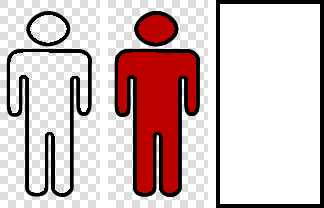
To make this work, you will need three separate images:
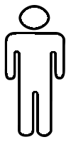
- An image that is the “empty” outline of the object — aside from the outline, all pixels should be transparent, as represented by the grey checkerboard grid in the example image below.
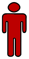
- An image which represents the fully “filled” object (again, all pixels that are not part of the filled image should be transparent).
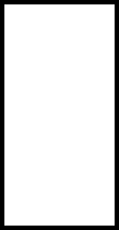
- A basic white mask (including the required black border).
Using these three elements, the general concept is to place the “filled” image on the screen, then overlay (draw at the exact same place on the screen) the “outline” image. This in itself won’t do anything — merely the outline will overlay the filled image. However, when you create and apply the mask to the bottom layer, you will gain the ability to set the position of that mask and effectively indicate how “full” the object is.
Basic setup
Consider this code:
|
1 2 3 4 5 6 7 8 9 10 11 12 13 14 15 16 17 |
display.setDefault( "background", 1, 1, 1 ) -- Place the "filled" object on the screen local filledUI = display.newImageRect( "filled.png", 100, 200 ) filledUI.x = display.contentCenterX filledUI.y = display.contentCenterY -- Create the mask object local UIMask = graphics.newMask( "mask.png" ) -- Apply the mask to the bottom image ('filledUI') filledUI:setMask( UIMask ) filledUI.maskY = 0 -- Overlay the "outline" object over the "filled" object local outlineUI = display.newImageRect( "outline.png", 100, 200 ) outlineUI.x = display.contentCenterX outlineUI.y = display.contentCenterY |
The first block of code defines the underlying “filled” image (the image completely filled with color). For convenience, we position this object in the center of the content area.
Next, we create a mask (UIMask) using graphics.newMask(). This mask image is solid white except for the required black border around the edges. In this case, since the UI image is 100×200 pixels, the mask consists of a 100×200 area of white plus a 4 pixel black border, resulting in an overall mask image of 108×208. Once created, the mask is applied to the underlying image (filledUI) and positioned at a maskY value of 0 (this position will be important in the next step).
Next, we overlay the “outline” image (outlineUI) on top. This element will simply be used as a frame for the UI object as we adjust the mask position on the underlying filled image.
Controlling the fill
The fill of the UI meter is completely controlled by adjusting the y position of the mask (maskY). In this example, since the object is 200 pixels tall, we can set this value to 100 to set the visual health level at 50%. As a convenience method to calculate the proper position, we can use the following code:
|
1 2 3 4 |
local meterLevel = 0.25 -- 25% = 25/100 = 0.25 local maskPosition = filledUI.height * ( 1 - meterLevel ) filledUI.maskY = maskPosition |
Alternatively, you can achieve an animated fill effect by transitioning the mask’s position. Using a transition on the mask position is very similar to a typical positional transition, except in this case, we transition the maskY property, not the y property of the actual image:
|
1 |
transition.to( filledUI, { time = 1000, maskY = maskPosition } ) |
Conclusion
As demonstrated, creating a stylish UI meter is simple and only requires the use of three elements, a simple calculation, and a direct set (or transition) of the underlying object’s mask position. If you wish to experiment with this code, you may copy/save the following images to your system as a basis for testing:


Joe
Posted at 07:08h, 11 SeptemberNice tutorial, thank! This solves my question I had for a long time.
Hope you can give more tutorials like this to solve some things we see in designing games with Corona.
Adi
Posted at 00:31h, 18 SeptemberI like this solution. I usually used plain rect to gradually fill meters but this concept allows for more flexible shapes.