21 November 2013
Guest piece: Adding polish to your mobile game
Noah Malewicz is the founder of Chunky Apps, an independent development studio of one. He is passionate about making fun, cartoony games for mobile devices and uses Corona SDK to accomplish this goal. His latest game, City Birds, was a Corona App of the Week in mid-October and Noah was featured as a guest on Corona Geek shortly thereafter.
After attending a NY-based Meetup, Noah was inspired to focus on adding polish to his game – starting with jazzing up the “Menu” screen. In his guest piece, he shares how he accomplished this task, along with offering tips for other indie developers.
 Making your game look polished can take a lot of work. In this post, I will talk about an often overlooked part of your game – the “Menu Screen” – and what you can do to add a little life and excitement to it.
Revamping the Menu screen
Over the summer, I attended a Meetup in New York City conducted by Jesse Freeman from Microsoft entitled: “How to Successfully Polish Your Game.” He had many good insights and I’d like to share one of them with you that really took City Birds to the next level: polishing my Menu screen.
The basic idea is to get “movement” on your Menu screen. This could be anything from a blinking Start button to having the individual elements slide into position from offscreen. That movement or animation, even if it’s very minimal, has a big impact on the look and feel of the game.
Up until that particular Meetup, I had been working hard on my gameplay without really considering the Menu screen. I planned on showing the game logo with a big “PLAY” button and I figured that any other buttons I needed would somehow “fit in.”
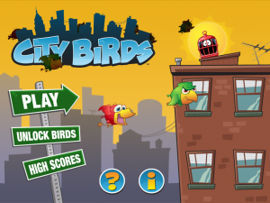
 After the event, I decided to completely redesign my Menu screen to fit the feel of the game. I pulled in one of the building images I was using in the game and put a birdcage, with a bird occupant, on the roof of it. This gives players a hint to the gameplay, where they will need to drag the birds into cages. I also carried the “city” theme into my Menu by making my buttons actual street signs that you would see in a city.
Bringing in the movement
I was happy with the look of the screen, so it was time to work on the movement. Using Corona’s transition library, I was able to easily make the street signs slide in from the left and the building slide in from the right. Voilà; instant action! Then for a little effect, I had the other two buttons on the bottom slide in last, just to stack the animation, so everything didn’t happen at once.
Once I was happy with the finished Menu screen, I wanted to up the ante a bit and thought: “What if the birds actually flew through the screen?” I already had the code to make them fly so why not try it here? Turns out, it looked really cool. The Menu screen had constant movement now and once the birds reached the end of the screen, they would reappear from the left again. It really brought the game to life.
Some final touches
Finally, I tried adding the whole in-game dragging mechanic to the birds on the Menu screen. While I liked it at first, I ultimately decided it was too much and took it out. I also wanted to create a 3D feel with some birds off in the distance that would fly behind the building, so the dragging just didn’t make sense.
The final touch I added may not be noticed by many but it’s still pretty cool. In City Birds, you can unlock more and more birds. I decided once you unlock a bird in the game, they would also unlock on the Menu screen. So once you unlock a bird or two, look closely and you should see your new friend flying happily about on the Menu screen with his pals.
In conclusion
All in all, I’m very happy with the way the final Menu screen came out – it’s much better than what I had originally planned. All this improvement came from just trying to get a little movement into my Menu screen. A good takeaway lesson is that you’re not finished after all the gameplay has been coded and the game is playing just right – don’t forget to make the wrapper look just as good as what you have on the inside.


Satwant
Posted at 15:34h, 22 NovemberBrilliant, very inspiring!
Dave Baxter
Posted at 09:40h, 23 NovemberFirst impressions count and seeing that menu would give me a good impression of the game. Which is always a good way to start gamers off.
Oh and for reason I thought this post was going to be about adding the Polish language to your game 🙁
Dave
Noah (Chunky Apps)
Posted at 07:29h, 25 NovemberThanks Satwant, glad you enjoyed the post!
Ha! Sorry to disappoint you Dave, maybe that can be my next post?